
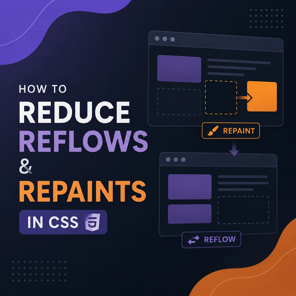
How to Reduce Reflows and Repaints in CSS and JavaScript
A slow visual update is not always caused by CSS. It may result from JavaScript execution, style calculation, layout, painting, image decoding, or compositing.
“Reflow” and “repaint” are commonly used terms, but modern browser performance tools usually describe the relevant stages as:
- Style calculation
- Layout
- Paint
- Composite
Layout determines the size and position of elements. Paint records how elements should be drawn. Compositing combines painted layers into the final frame.
Performance problems occur when a page repeatedly performs expensive work—especially when JavaScript forces the browser to calculate layout synchronously several times during one task.
This guide explains how to identify that work and reduce it without changing application behavior or accessibility.
The Browser Rendering Pipeline
A simplified rendering pipeline looks like this:
- Parse HTML into the DOM.
- Parse CSS and calculate styles.
- Determine element geometry during layout.
- Record drawing operations during paint.
- Composite visual layers.
- Present the completed frame.
Not every update runs every stage.
For example:
- Changing an element’s width may require layout, paint, and compositing.
- Changing a background may require paint and compositing.
- Changing a transform may sometimes require only compositing.
- Modifying an element that is not currently rendered may require little immediate work.
The exact behavior depends on:
- Browser engine
- Element size
- Page structure
- Containment
- Layer creation
- Current styles
- Device and graphics hardware
- Whether the browser has pending changes
Do not optimize based only on a generic list of “expensive CSS properties.” Record a performance trace and inspect what the browser actually does.
What Is Reflow?
Reflow is an older term for recalculating layout.
Layout determines geometric information such as:
- Width
- Height
- Position
- Alignment
- Line wrapping
- Grid and flex placement
- Scrollable dimensions
Layout may be required after changes to:
- Content
- Fonts
- Element dimensions
- Padding or margins
- Grid or flex rules
- Positioning
- Viewport size
- DOM structure
- Visibility in the layout
The cost depends on how much of the document is affected. Updating one isolated component is different from recalculating a large, deeply connected page.
What Is Repaint?
Repaint refers to updating visual output without necessarily changing element geometry.
Paint-related changes can include:
- Colors
- Borders
- Shadows
- Backgrounds
- Text decoration
- Some filters
- Visual effects
Painting a small element may be inexpensive. Painting a large area with complex effects may be costly.
A repaint is not automatically a performance problem. Repeated or large paint work that blocks timely frame presentation is the real concern.
What Is Compositing?
Browsers may place some content on separate composited layers. The compositor can then move or blend those layers without repainting their contents.
Animations involving transform and opacity are often good candidates for compositor work:
.card {
  transition:
    transform 180ms ease,
    opacity 180ms ease;
}

.card:hover {
  transform: translateY(-4px);
  opacity: 0.95;
}
However, “uses transform” does not guarantee GPU acceleration or perfect performance.
A browser decides how layers are created. Too many layers can increase:
- Memory usage
- Texture uploads
- Compositing cost
- Layer-management overhead
Measure the result instead of assuming that every transform is free.
The Most Important Problem: Layout Thrashing
Browsers normally defer and batch style and layout work.
A forced synchronous layout occurs when JavaScript changes styles and then immediately asks the browser for current geometric information. The browser may have to complete pending style and layout work before it can return the requested value.
Layout thrashing occurs when code repeatedly alternates between writes and layout-dependent reads.
Problematic example
const container =
  document.querySelector(".container");

const items =
  document.querySelectorAll(".item");

for (const item of items) {
  item.style.width = "50%";

  console.log(
    container.getBoundingClientRect().width
  );
}
Each iteration writes a style and then requests current geometry. Depending on the surrounding page state, this can repeatedly force layout.
Improved version
Read first, then perform the writes:
const container =
  document.querySelector(".container");

const items =
  document.querySelectorAll(".item");

const containerWidth =
  container.getBoundingClientRect().width;

for (const item of items) {
  item.style.width =
    `${containerWidth / 2}px`;
}
The browser can process the group of writes together later.
Chrome’s performance guidance recommends separating geometry reads from style writes to avoid repeated forced synchronous layouts.
Layout-Dependent DOM Reads
These APIs may require current layout information:
offsetWidthoffsetHeightoffsetTopoffsetLeftclientWidthclientHeightscrollWidthscrollHeightgetBoundingClientRect()getComputedStyle()in relevant situations
Reading these values is not inherently bad.
A read is most likely to cause a synchronous calculation when:
- Styles or DOM structure have changed.
- The browser has not yet updated layout.
- JavaScript immediately requests a current geometric value.
Do not remove every layout read. Reduce unnecessary reads and avoid alternating reads and writes inside loops.
1. Group DOM Reads and Writes
Organize rendering code into phases:
function updateCards(cards) {
  // Read phase
  const measurements = cards.map(card => ({
    card,
    width: card.getBoundingClientRect().width
  }));

  // Calculate phase
  const updates = measurements.map(item => ({
    card: item.card,
    compact: item.width < 320
  }));

  // Write phase
  for (const update of updates) {
    update.card.classList.toggle(
      "card--compact",
      update.compact
    );
  }
}
This pattern reduces the chance that each iteration will trigger a new layout calculation.
Where possible, let CSS perform responsive layout instead of measuring widths in JavaScript.
Container queries may remove the need for this JavaScript entirely:
.card-container {
  container-type: inline-size;
}

@container (max-width: 320px) {
  .card {
    grid-template-columns: 1fr;
  }
}
2. Prefer CSS Layout Over JavaScript Measurements
Avoid calculating values in JavaScript when CSS already has the required layout information.
Instead of:
const width =
  window.innerWidth < 768
    ? "100%"
    : "50%";

panel.style.width = width;
use a media query:
.panel {
  width: 50%;
}

@media (max-width: 767px) {
  .panel {
    width: 100%;
  }
}
Similarly, consider:
- Flexbox
- Grid
- Media queries
- Container queries
min()max()clamp()aspect-ratio
CSS can respond to layout changes without repeated application-level measurement code.
3. Animate transform Instead of Layout Position
Animating left, top, width, or height usually requires layout work for each animation frame.
Less efficient approach:
.panel {
  position: relative;
  left: 0;
  transition: left 250ms ease;
}

.panel.is-open {
  left: 300px;
}
Better candidate:
.panel {
  transform: translateX(0);
  transition: transform 250ms ease;
}

.panel.is-open {
  transform: translateX(300px);
}
The transform version often avoids layout during the animation.
It still needs to be measured. A large element with expensive visual effects may remain costly to composite.
4. Use Opacity Carefully
Opacity can produce efficient fades:
.dialog {
  opacity: 0;
  transition: opacity 180ms ease;
}

.dialog.is-visible {
  opacity: 1;
}
But this is not a complete visibility implementation.
An element with opacity: 0:
- Still occupies layout space
- May remain focusable
- May remain clickable
- May be announced by assistive technology
- Can block interaction with content behind it
If the element should be unavailable when hidden, update the relevant interaction and accessibility state:
.dialog {
  opacity: 0;
  visibility: hidden;
  pointer-events: none;
  transition:
    opacity 180ms ease,
    visibility 0s linear 180ms;
}

.dialog.is-visible {
  opacity: 1;
  visibility: visible;
  pointer-events: auto;
  transition-delay: 0s;
}
Depending on the component, the HTML hidden attribute, conditional rendering, or the native dialog element may be more appropriate.
Do not replace display: none with opacity: 0 only to avoid layout. The two techniques have different semantics.
5. Batch DOM Insertion
This code repeatedly reparses and replaces content:
for (let index = 0; index < 1000; index++) {
  list.innerHTML += `<li>Item ${index}</li>`;
}
Besides being inefficient, string-based HTML insertion can introduce injection risks when values are untrusted.
Create the nodes while they are detached:
const fragment =
  document.createDocumentFragment();

for (let index = 0; index < 1000; index++) {
  const item =
    document.createElement("li");

  item.textContent = `Item ${index}`;
  fragment.append(item);
}

list.replaceChildren(fragment);
The fragment allows the final insertion to happen as one logical DOM update.
Browsers can batch multiple DOM writes, so appending in a loop does not automatically mean one layout per append. The worst problems usually appear when code interleaves the appends with layout reads.
6. Avoid Recreating Large Subtrees
Updating one value should not require replacing an entire component tree.
Instead of rebuilding a complete table when one status changes:
table.innerHTML =
  renderAllRows(updatedRows);
update the affected node:
const row = table.querySelector(
  `[data-order-id="${orderId}"]`
);

const status =
  row?.querySelector(".order-status");

if (status) {
  status.textContent = newStatus;
}
Frameworks can help target updates, but unnecessary component renders can still produce excessive DOM work.
Use framework profiling tools to identify:
- Repeated renders
- Unstable props
- Large list updates
- Expensive derived values
- Components subscribed to excessive state
7. Reduce DOM Size Where It Matters
A large DOM can make style calculation and layout more expensive, but an arbitrary node-count target is not useful by itself.
Investigate:
- Large tables
- Long activity feeds
- Hidden duplicate interfaces
- Deep component nesting
- Offscreen menus rendered in advance
- Repeated decorative wrappers
- Lists containing thousands of rows
For large lists, use:
- Pagination
- Incremental rendering
- Windowing or virtualization
- Server-side filtering
- “Load more” behavior
Virtualization renders only the currently visible section and a small buffer.
It introduces complexity involving:
- Keyboard navigation
- Screen readers
- Focus retention
- Variable row heights
- Browser find-in-page
- Printing
Test those behaviors before deploying a virtualized interface.
8. Use CSS Containment Deliberately
CSS containment tells the browser that part of the document has limited influence outside its boundary.
Example:
.widget {
  contain: layout paint;
}
Potential benefits include limiting layout and painting work to the contained component.
Containment changes layout and painting behavior, so it can affect:
- Positioned descendants
- Overflow
- Sizing
- Stacking
- Content that visually extends outside the component
Do not apply contain globally without testing the result.
Offscreen content
For large pages with independent sections:
.article-section {
  content-visibility: auto;
  contain-intrinsic-size: auto 600px;
}
content-visibility: auto allows the browser to skip some rendering work for offscreen content. contain-intrinsic-size provides an estimated placeholder size and can reduce scrollbar jumps.
MDN documents both containment and content-visibility, including their layout implications.
Test:
- Scrolling
- Find-in-page
- Anchored navigation
- Focus movement
- Printing
- Accessibility behavior
- Layout stability
9. Reserve Space for Images and Embeds
Images without known dimensions can change page layout after they load.
Specify intrinsic dimensions:
<img
  src="/images/product.webp"
  alt="Blue laptop"
  width="800"
  height="600"
>
Responsive CSS can preserve the aspect ratio:
img {
  display: block;
  max-width: 100%;
  height: auto;
}
For videos, advertisements, maps, and third-party widgets, reserve space with dimensions or aspect-ratio:
.video-wrapper {
  aspect-ratio: 16 / 9;
}
This does not necessarily reduce every layout calculation, but it prevents disruptive shifts caused by late-arriving content.
10. Handle Scroll and Resize Work Carefully
Scroll and resize events can fire frequently.
A fixed delay is not always the right solution:
window.addEventListener(
  "resize",
  debounce(handler, 200)
);
Debouncing is appropriate when work should happen only after activity stops, such as saving a final layout preference.
For visual updates that should follow scrolling, schedule at most one update per frame:
const progress =
  document.querySelector(".scroll-progress");

let latestScrollY = 0;
let frameScheduled = false;

window.addEventListener(
  "scroll",
  () => {
    latestScrollY = window.scrollY;

    if (frameScheduled) {
      return;
    }

    frameScheduled = true;

    requestAnimationFrame(() => {
      progress.style.transform =
        `translateX(${latestScrollY}px)`;

      frameScheduled = false;
    });
  },
  { passive: true }
);
Do not place unrelated expensive work inside requestAnimationFrame(). The callback must finish before the next frame can be presented.
For observing element-size changes, consider ResizeObserver rather than repeatedly measuring during every window resize:
const observer = new ResizeObserver(entries => {
  for (const entry of entries) {
    const compact =
      entry.contentRect.width < 320;

    entry.target.classList.toggle(
      "is-compact",
      compact
    );
  }
});

observer.observe(component);
Keep observer callbacks small because they run close to rendering.
11. Use will-change Sparingly
will-change informs the browser that a property is likely to change:
.dragging-item {
  will-change: transform;
}
It may help the browser prepare an element for animation, but applying it broadly can consume memory and create unnecessary layers.
Avoid:
* {
  will-change: transform;
}
Prefer applying it only to elements that are about to animate and removing it when it is no longer useful:
element.addEventListener(
  "pointerdown",
  () => {
    element.style.willChange = "transform";
  }
);

element.addEventListener(
  "pointerup",
  () => {
    element.style.willChange = "auto";
  }
);
Do not add will-change unless measurement shows a benefit.
12. Simplify Expensive Visual Effects During Animation
Effects such as these can increase paint or compositing cost:
- Large blurred shadows
- Backdrop filters
- Large CSS filters
- Multiple overlapping translucent elements
- Large fixed backgrounds
- Complex masks and clipping
- Effects covering most of the viewport
The cost depends on the size of the affected area, device, browser, and animation.
Instead of removing every shadow, test whether the effect creates measurable frame delays.
Possible alternatives include:
- Animate a smaller wrapper
- Reduce blur radius
- Use a pre-rendered asset
- Avoid animating the effect itself
- Limit the effect to a smaller area
- Disable nonessential motion on constrained devices
13. Respect Reduced-Motion Preferences
Performance optimization should not come at the expense of accessibility.
Users can request reduced motion:
.card {
  transition: transform 180ms ease;
}

@media (prefers-reduced-motion: reduce) {
  .card {
    transition: none;
  }
}
Reduce or remove animations that are:
- Decorative
- Continuous
- Large in scale
- Triggered by scrolling
- Likely to cause discomfort
Do not remove essential feedback. Replace movement with another clear state change when necessary.
14. Measure with Chrome DevTools
Do not guess which CSS rule causes the problem.
Record a Performance trace
- Open Chrome DevTools.
- Select Performance.
- Start recording.
- Reproduce the slow interaction.
- Stop recording.
- Inspect long tasks, style recalculation, layout, paint, and compositing activity.
Look for:
- Repeated layout events
- Large layout duration
- Forced reflow warnings
- Large paint areas
- Long JavaScript tasks
- Rendering work after every scroll event
- Unexpected component updates
Chrome DevTools includes a Forced Reflow insight for identifying expensive synchronous layout work.
Use Paint Flashing
In DevTools’ Rendering tools, enable paint flashing to see areas that are repainted.
This helps answer:
- Is the whole page repainting?
- Is only the animated component repainting?
- Does a fixed element invalidate a large area?
- Does a hover state affect more content than expected?
Flashing indicates repainting, not necessarily a serious problem. Correlate it with timing data.
Inspect layers
Layer tools can help determine:
- Which elements have composited layers
- Layer dimensions
- Memory implications
- Unexpected layer creation
Do not attempt to create a separate layer for every element.
15. Measure the User-Visible Result
Track outcomes, not just the number of layout events.
Useful measurements include:
- Interaction to Next Paint
- Long animation frames
- Long tasks
- Frame consistency
- Layout duration
- Paint duration
- Cumulative Layout Shift
- JavaScript execution time
- Memory use
- Battery impact on mobile devices
Layout work can contribute to poor interaction responsiveness, but the existence of layout events alone does not prove a Core Web Vitals problem.
Compare before and after using:
- The same browser version
- The same device
- The same viewport
- The same test data
- Similar network and CPU conditions
- Multiple runs
A Practical Layout-Thrashing Example
Before
const cards =
  document.querySelectorAll(".card");

for (const card of cards) {
  const width =
    card.getBoundingClientRect().width;

  card.style.height =
    `${width * 0.75}px`;

  const height =
    card.getBoundingClientRect().height;

  card.style.fontSize =
    height > 300 ? "18px" : "16px";
}
This alternates geometry reads and style writes.
Improved version
const cards = [
  ...document.querySelectorAll(".card")
];

// Read
const measurements = cards.map(card => ({
  card,
  width: card.getBoundingClientRect().width
}));

// Calculate
const updates = measurements.map(item => {
  const height = item.width * 0.75;

  return {
    card: item.card,
    height,
    large: height > 300
  };
});

// Write
for (const update of updates) {
  update.card.style.height =
    `${update.height}px`;

  update.card.classList.toggle(
    "card--large",
    update.large
  );
}
CSS:
.card {
  font-size: 16px;
}

.card--large {
  font-size: 18px;
}
An even better solution may use aspect-ratio and a container query, removing the JavaScript measurements:
.card-container {
  container-type: inline-size;
}

.card {
  aspect-ratio: 4 / 3;
  font-size: 16px;
}

@container (min-width: 400px) {
  .card {
    font-size: 18px;
  }
}
Performance Checklist
Before changing code
- Record the slow interaction.
- Confirm whether time is spent in JavaScript, layout, paint, or compositing.
- Identify the affected elements.
- Save a baseline trace.
Layout
- Group DOM reads before DOM writes.
- Avoid layout-dependent reads after style changes.
- Prefer CSS layout over JavaScript measurements.
- Reserve space for images and embeds.
- Reduce unnecessarily large DOM subtrees.
- Consider virtualization for very large lists.
- Test containment on independent components.
Animation
- Prefer
transformandopacitywhen behavior permits. - Do not assume compositor acceleration.
- Avoid animating large expensive effects.
- Use
will-changeonly after measurement. - Support
prefers-reduced-motion. - Confirm hidden elements are not accidentally interactive.
Event handling
- Keep scroll and resize handlers small.
- Schedule visual updates deliberately.
- Use passive listeners where appropriate.
- Use
ResizeObserverfor element-size changes. - Avoid expensive work inside animation-frame callbacks.
Verification
- Record a new performance trace.
- Compare layout and paint duration.
- Test on a lower-powered mobile device.
- Verify keyboard and screen-reader behavior.
- Confirm that visual effects still meet design requirements.
- Monitor real-user responsiveness after deployment.
Common Mistakes
Avoid these common performance mistakes:
- Assuming every layout event is harmful
- Replacing
display: nonewithopacity: 0without considering semantics - Applying
will-changeto many elements - Creating unnecessary composited layers
- Rewriting safe DOM code without measurement
- Using
innerHTML +=inside loops - Measuring layout after every style change
- Running heavy work in scroll handlers
- Debouncing interactions that require immediate visual feedback
- Virtualizing content without testing accessibility
- Applying containment without understanding side effects
- Optimizing only on a high-end development computer
Final Thoughts
Reflows and repaints are normal parts of browser rendering. The goal is not to eliminate them.
The real problems are:
- Unnecessary layout work
- Forced synchronous layout
- Repeated read/write cycles
- Large rendering areas
- Excessive DOM updates
- Expensive visual effects
- Heavy event handlers
- Poorly controlled animation
Begin with a performance recording. Identify whether JavaScript, layout, paint, or compositing is delaying the frame. Then make the smallest targeted change and measure again.
A smooth interface is not created by applying transform, will-change, or containment everywhere. It comes from understanding the browser’s actual workload and reducing the work users have to wait for.
Try Next
Other utilities you might find helpful
Regex Tester
Test and debug regular expressions with live matches.
Regex Debugger
Understand regex step-by-step with explanations.
JSON Formatter
Format, validate, and minify JSON instantly.
Base64 Encoder/Decoder
Encode and decode Base64 strings and files.
SQL Explain Parser
Analyze SQL execution plans and optimize queries.
DOM Complexity Analyzer
Analyze HTML DOM structure, detect deep nesting, count nodes, and identify performance issues instantly.